DRYING PVA ONTO ACETATE TO FROM VISUAL INSPO
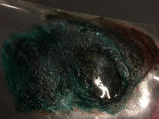
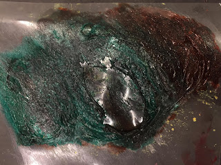
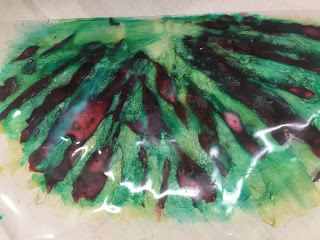
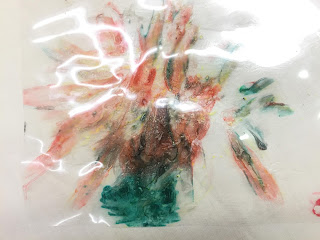 I wanted to try and use acetate as you are able to use light to photograph and change how the composition looks, I used PVA and Indian ink within these experiments because I already had acknowledged the pigmentation of them when mixed with PVA; I wanted to re create the formation of lines shown following from the visual inspiration. Below shows a process of how I have used my paintbrush to spread the PVA mixture with Ink onto the acetate.
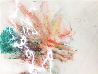 I set myself this aim to use onto acetate after using PVA on top of clingfilm which was heated, i chose to still use blue ink again after using it on other experiments as i really liked how explosive it looks and i thought that if i could see if i could exaggerate the colour by adding lighting to it when photographed, it would be to use acetate because it is a see through surface. I made quick marks using a medium sized brush in the shapes and lines that i could see from when the fireworks had exploded into the sky. I used the blue ink and ova first and dabbed the paint slightly where i saw a clump of colour before it exploded, by dabbing the medium it created a thicker and much more spiked texture, I then used a red ink as another separate layer but did not mix the colours because i believed that it would not look like there are separate layers.
  Overall, I love how the acetate began to move and distort itself when I melting and dried the mixtures on top. To improve I think I would add yellow oil pastel to allow the viewer to be able to see the real texture that has been picked up. I also wanted to portray the similarity to fireworks s the colours are not actually combined they are released into the sky as separate single no-tonal colours. I really love how the colours merged ontop of one another and have both created this rough texture where you can imagine the brush strokes, I would like to add the yellow oil pastel to the experiments because on the other experiments where I added the yellow oil pastel it really highlighted the texture as it has been compressed by the heat gun. Following on from this I actually lightly moved my hand as fast as i could across the layers to uncontrollably bright out a warm tones on top of such a cold colour such as blue. To do next, i need to photograph this composition in different settings of lighting to see if it actually gives off a different effect. Also, i could see this being apart of he collage but i would maybe hold more texture onto of the acetate such as newspaper and then working on top of that, then maybe adding clingfilm and melting it.
 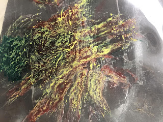 |
| Applied a black surface to see if the composition changes |
APPLYING A NEWSPAPER MATERIAL TO THE COMPOSITION
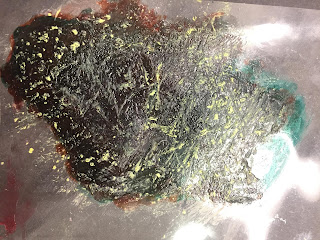
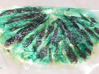
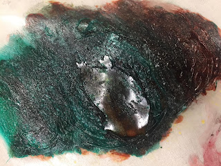 Firstly, I had set myself the challenge to add clingfilm to the composition because from previous experiments where i had incorporated and seen the clingfilm melt into shapes that look like deep holes to create texture, I got a piece of acetate and mixed the blue and red inks together as opposed to separating them, i then decided to quickly stick a single piece of clingfilm over the ink whilst t was wet and then I used a heat gun to dry it together. The reason why I put only one layer of clingfilm onto the composition was because i wanted the colour to show through and liked the way the ripples in the clingfilm had made such an effect, whereas if i were to put lots of layers of clingfilm onto it then the texture would be ruined. Due to the clingfilm being so thin the ink had actually spread over the top of it whilst being practically glued to it when heated, so no white, natural colour of the clingfilm were to be shown. Overall i really do like how the texture appears wet even though it has dried and really does remind me of the texture you'd see on a planet- relating to this I was studying the book called 'Hubble' and 'planets' within the same hour of doing the experiments so i wanted to re create the texture i saw, to me, the images within the books appear to be similar to what i have experimented with. After looking at them though i did want to add a dry medium to really prove the amount of texture as an involvement to my theme, with there already being dark and harsh transparent shadows on the texture i believed that adding a yellow oil pastel on top would prove how textured it is. However, i do not like how the yellow has broken into the deeper parts of the texture because it has ruined the sight of seeing both the red and blue ink.
 MARK MAKING WITH PVA AND INK ONTO ACETATE
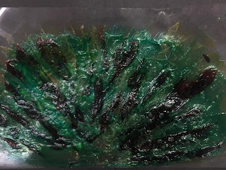
I have done this experiment with the intentions of creating a response to the visual inspiration of the photographs of fireworks and i wanted to see if i were able to create an experiment where you are clearly able to see the colour without texture in one area but then another with lots of it, with that in mind i believed that Acetate was the best option as it is transparent and easily able to see through it.
 I firstly mixed lots of PVA with blue indian ink and i applied lots of PVA because i wanted to experiment using one layer of it but using more than usual, and i have used the same ink colours as to my previous ones because i am focusing on creating texture and not colour. After applying the ink and PVA together i used a very large brush and moved the mediums in a down to up motion, like the movement shown in the images i have photographed as the firework explodes into the sky (before it explodes). I then added red ink to PVA and applied it on top of the previous textured marks to bring out the different sparks of colour that are apart of the photo which lighten it up, When dried i did actually notice that it merged with the blue ink and PVA which I was really surprised about, when turning the experiment around i loved how although there was no texture you are able to clearly see the colours merging together, there are slightly more pigmented parts of red ink when you look at it from this angle in comparison. To improve i would again begin to add more and more layers to it.

Comments
Post a Comment